King Consulting
Having been a partner in another consulting firm, Frank King decided to go it on his own. With a last name like king, you'd have to be your own ruler, wouldn't you? I had helped Frank's previous firm create a brand identity, which they were pleased with, so when he decided to go solo he reached out to me to help him with his new identity.
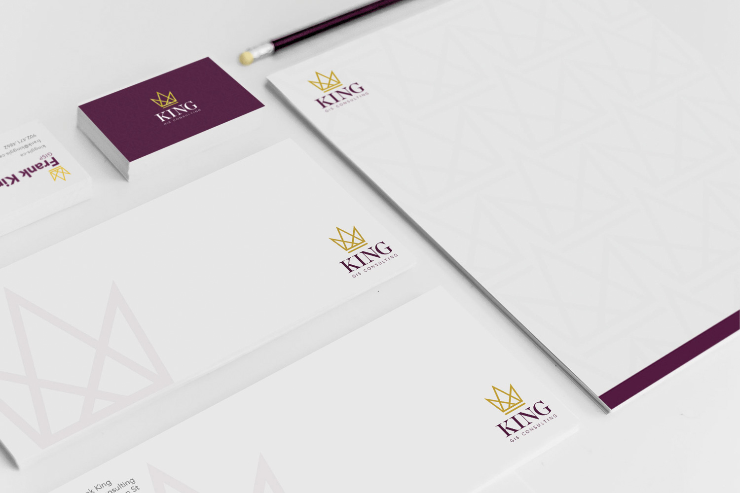
Geographic information system consultants study geographic data to help many different organizations, from health and government to retail and telecommunications, solve problems. With that in mind, I knew that Frank's logo had to be clean, clear, and confident. After exploring a bunch of ideas, both Frank and I felt like this geometric crown encompassed the structural thinking of data analysis while still having a bit of fun.

Fit for a king
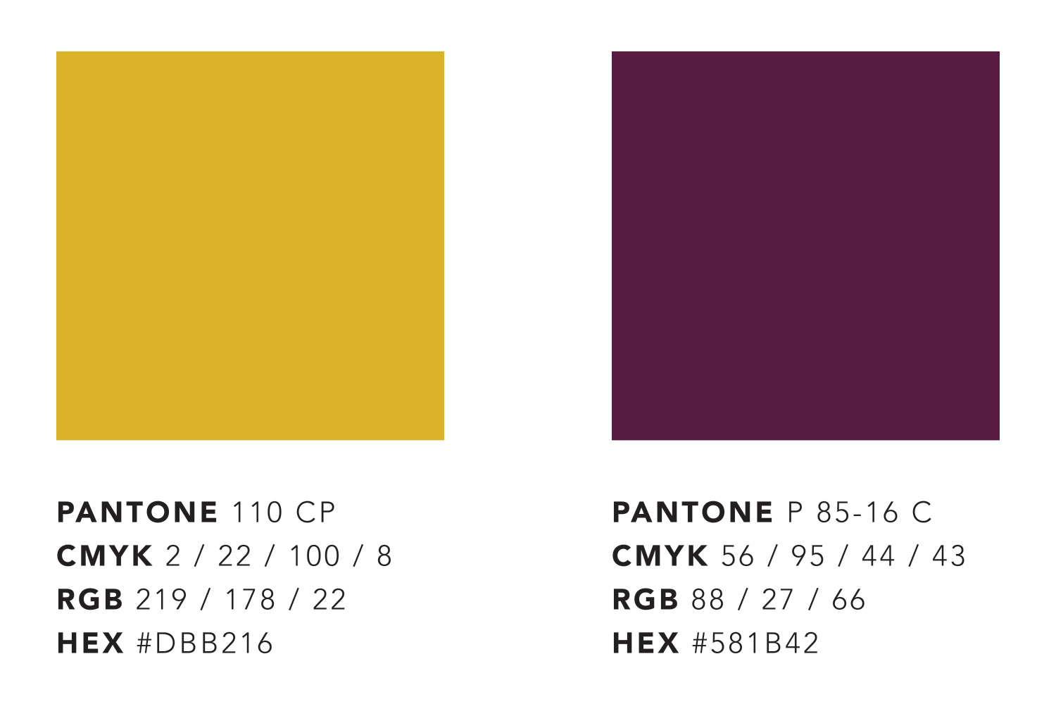
After playing around with a bunch of colour palettes I eventually narrowed it down to colours "fit for a king". We both agreed that the gold and purple often found in royal fabrics would work great for Frank's identity.
For his business cards, we went with a gold foil for the crown, which looked fantastic, or as Frank put it: "The gold crown is the highlight. The pics won’t do it justice...it shimmers when you tilt it back and forth."

Because GIS is all about data, and finding patterns, I felt that it was important that pattern be a part of Frank's brand. With royal fashion still top-of-mind, I started looking at the patterned luggage of Louis Vuitton, something I had always found visually striking. The crown emblem of the logo made for a perfect and unique pattern that could add subtle texture throughout Frank's marketing
At the end of the project both Frank and I were very happy with the results of his identity design and I wish him continued success.