ICONS & ILLUSTRATIONS
When I was an art student, many moons ago, I always loved when professors gave us projects where we had to take a realistic subject and break it down into its basic shapes. While simple in principle, it's extremely difficult in practice. This is the challenge when creating icons and digital illustrations. Computers, resolution, and usability have forced designers to break things like icons down into their simplest forms to make them easily digestible.

Below is a small selection of icons that I designed for Henry's eCommerce site. With so many categories to shop from, I really had to think, sketch, and keep reworking almost every single icon I created. On the site they aren't coloured, but I made a coloured version of them for my portfolio because I thought they looked a little more fun that way.
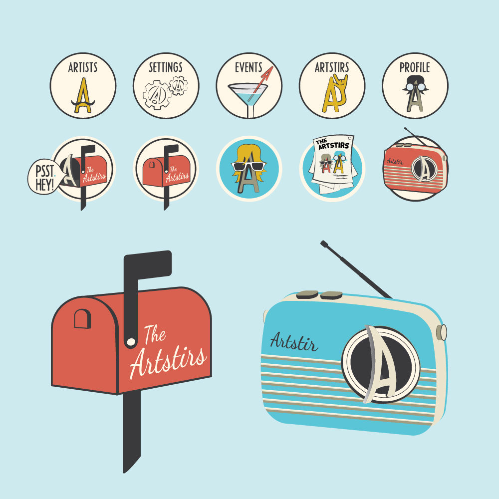
The two examples below are sets of icons that I created for a startup called Artstir a few years back. They were going to be a really neat new social media site, specifically for artists. They wanted a really retro aesthetic, beach-y colour palette, and loose, illustrative look to their interface and icon design. Unfortunately, their partnership dissolved before the project came to fruition. However, I spent so much time illustrating and then digitizing these icons that I still like to showcase them.

Finally, the two illustrations below were for a previous iteration of my personal website and portfolio. The screech is a nod to my Newfoundland heritage which you can read more on my About page.

